What to Wear for Family Pictures: Coordinating Outfits with Color Palettes That Pop
When it comes to creating timeless, beautiful family portraits, your wardrobe plays a big role.
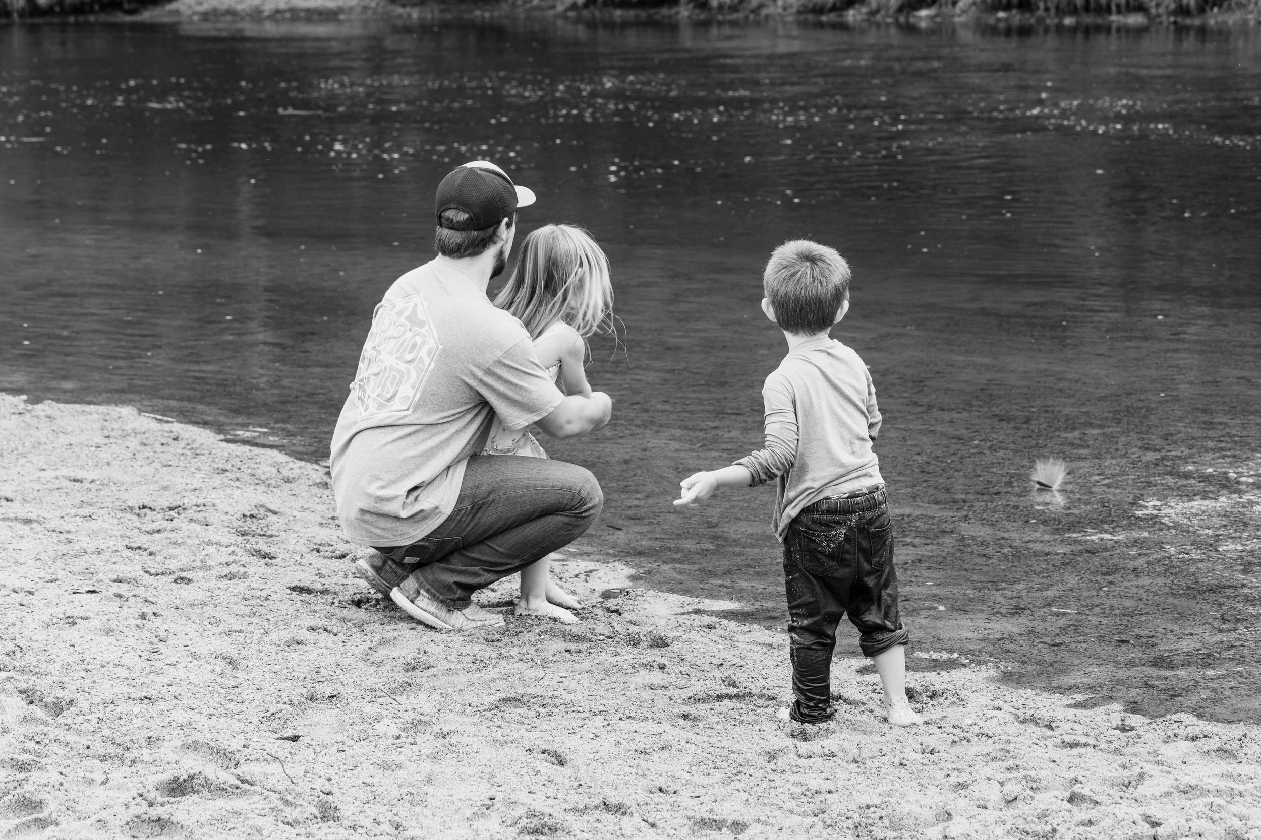
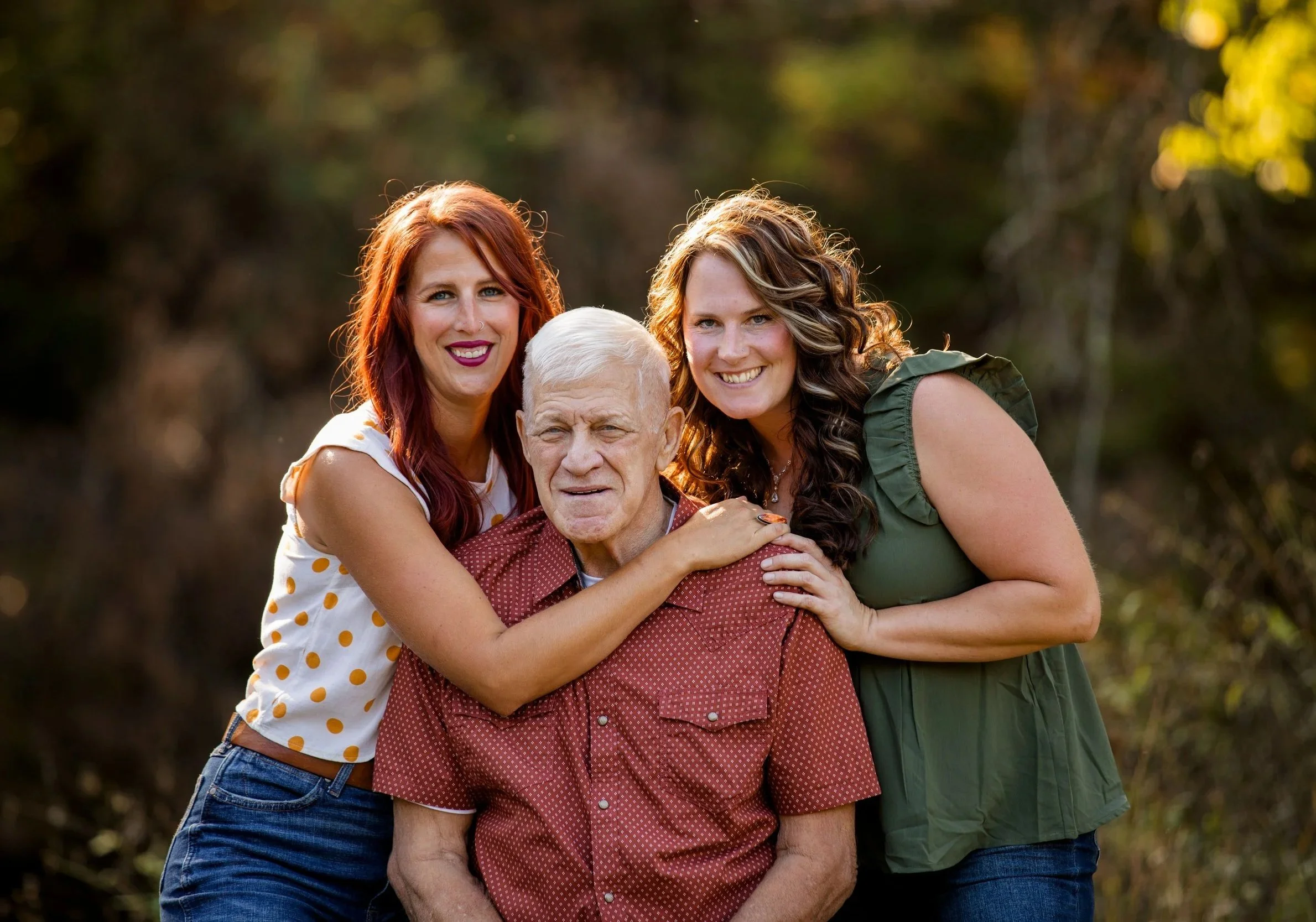
But don’t worry—you don’t need to match head to toe. The best photos happen when your family coordinates instead of duplicates.
The secret? A thoughtfully selected color palette. Coordinating your outfits around a shared set of colors creates a unified, stylish look that enhances your family’s connection, without looking too “matchy-matchy.”
Why Choose a Coordinated Color Palette?
Visual Harmony – Coordinated tones help your images look polished and cohesive.
Highlight Your Faces – Balanced colors make you the focus, not clashing clothes.
Timeless Appeal – Neutrals and complementary hues age gracefully in print and on walls.
Seasonal Vibes – Soft tones in spring, rich earth tones in fall… there’s a palette for every season.
Tips for Picking the Right Palette
Start with Neutrals – Think beige, cream, gray, navy, or olive as a base.
Add Color Pops – Choose 1–2 accent colors (like mustard, rust, or blush) to weave in with accessories or layers.
Think Texture Over Pattern – Textured fabrics (denim, knits, linen) create dimension without overwhelming.
Lay It Out – Snap a pic of everyone’s outfits laid out together. If it looks good there, it’ll look great in-camera.
5 Color Palettes for Your Family Session
Here are five curated palettes we recommend to our families. Please share them with everyone in your group, shop intentionally, and show up ready to shine!
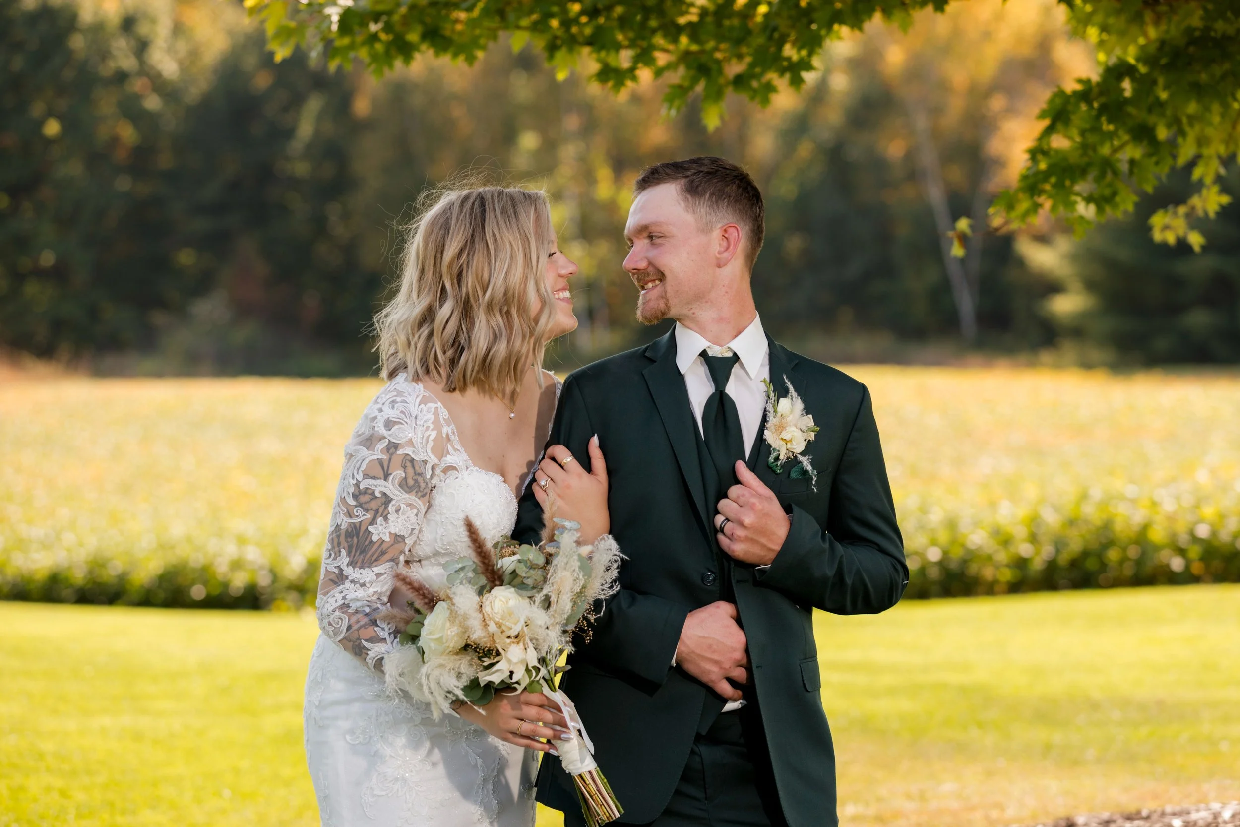
1. Warm & Earthy (Perfect for Fall)
Terracotta
Olive Green
Cream
Rust
Denim
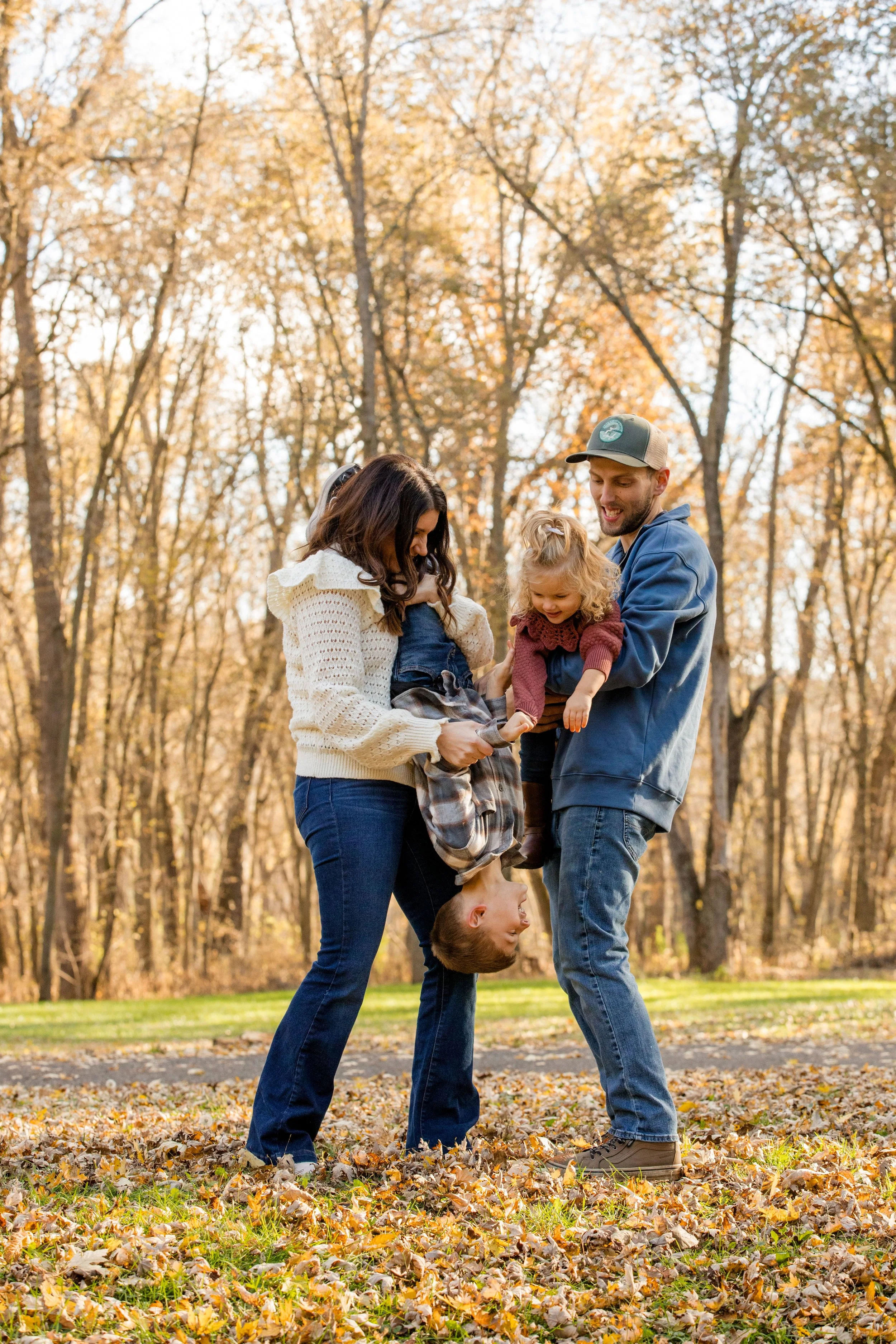
2. Soft & Neutral (Timeless Look)
Light Gray
Ivory
Taupe
Caramel
Dusty Rose
3. Ocean Breeze (Great for Summer or Beach Sessions)
Navy
Soft Blue
White
Sand
Sage Green
4. Classic & Cozy (For Winter or Evergreen Sessions)
Burgundy
Charcoal
Cream
Forest Green
Oatmeal
5. Spring Pastels (Fresh and Bright)
Blush
Soft Lilac
Light Tan
Sky Blue
White
Once you schedule your family session with Andrew Samplawski Photography, we’ll send you these palettes as a digital guide to help make outfit planning stress-free and straightforward.
Our goal? Making your session feel effortless—and making your family look amazing.

Explore Related Posts